You are not logged in.


Drinks Marketing & Wine Design Awards 2019: The results
In January, the judges assembled in West London to judge this year’s Drinks Marketing & Wine Design Awards. Here are the results.
AGENCY OF THE YEAR
PHIPPS PR
A very impressive entry from one of the UK wine trade’s leading and best-known PR agencies. Judge Rob Harrison, ex-Accolade Wines, of the RHH Group, asked: “Would I do business with them? Based on this entry – yes, I would.”
BRAND EXPERIENCE CAMPAIGN
GLEN SCOTIA GRAND TOUR FROM THE LOCH LOMOND GROUP
It’s a long way to go to visit, so why not bring the bar/distillery to somewhere near you? Judge David Cox thought it was “outstanding”.
DIGITAL & SOCIAL MEDIA/ INTEGRATED CAMPAIGN
HARP LAGER’S PURE HERE - SMARTS COMMUNICATIONS
Well thought through and put together, the judges agreed. Also, the entry was well explained.

PR CAMPAIGN OF THE YEAR WINNER
THE WORLD’S MOST SUSTAINABLE BEER BRAND, PROBABLY! - SMARTS COMMUNICATE
The judges said the campaign “ticked all the boxes”. “Hits the spot – sustain- ability, well thought through and exe- cuted, said Harrison.
HIGHLY COMMENDED
WORLD CLASS BARTENDER OF THE YEAR - BY SMARTS COMMUNICATE
Very impressive, but not new. The judges gave it a highly commended based on the sheer scale of the campaign to engage bartenders globally.

WINE DESIGN AWARDS
NEW DESIGN (INDIVIDUAL PRODUCT)
GOLD: DE BORTOLI ROSÉ FROM DE BORTOLI WINES
A well-established Australian wine producer possibly trying to shake o a rather dusty image with impressive design. The judges liked the label very much, nding it striking with great stand-out.
SILVER: DE BORTOLI BOTRYTIS SEMILLON BY FLORENCE BROADHURST
This used a well-known designer to entice particularly women drinkers to try this sweet, traditionally dessert wine. The judges felt that to try to make this a “session drink for women” was ambitious, to say the least.
NEW DESIGN (RANGE)
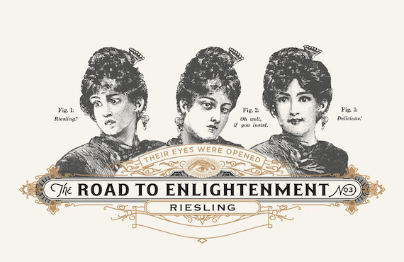
CATEGORY TROPHY WINNER: FOURTH WAVE WINE, THE ROAD TO ENLIGHTENMENT, BY DENOMINATION
There was a traditional feel but with a quirkiness. DI’s Shay Waterworth felt it showed a sense of humour. Harrison said the labelling was easy to navigate.
GOLD: CHAPEL DOWN, GREAT MINDS DRINK ALIKE, BY DENOMINATION
The black labels are quite mascu- line, the judges felt – were classy and impactful. One of the most polished entries.
SILVER: OFF THE LINE, BY BARLOW & CO
Fun, simple but the judges were con- cerned whether the label was premium enough for a £15-£20 wine.
BRONZE: COLOURS OF GEORGIA, BY GEORGIAN WINES & SPIRITS
The judges liked the colourful labels, but felt there was a lack of explanation. They looked great together but Harrison pointed out that a range is rarely put together in retail and you’d never see them before ordering in restaurants.
REPACKAGED WINE DESIGN (INDIVIDUAL)
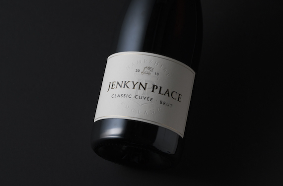
CATEGORY TROPHY WINNER: JENKYN PLACE, BY BARLOW & CO
The judges described it as “sub- tle but e ective. A classy upgrade. Exceptional”. They said the design- ers resisted the temptation to “revolutionise”.
GOLD: TERTINI, BY CO-PARTNERSHIP
The new look was attractive and the judges felt it was more classy looking. David Cox noted that the o en over- looked capsule had been addressed and improved.
SILVER: VANDENBERG WINE, BY CO-PARTNERSHIP The judges liked the bold, gold lettering, whereas before it had been very traditional and rather staid-looking.
REPACKAGED WINE DESIGN (RANGE)
CATEGORY TROPHY WINNER: SPAR, BY BARLOW & CO
Bearing in mind these wines are for convenience stores, the judges were impressed, particularly with the entry- level tier. Very well thought through and executed.

GOLD: STONELEIGH OF MARLBOROUGH, BY CO-PARTNERSHIP
Well branded throughout. The judges thought a good job had been done on the range.
SILVER: ALTANO WINES, BY OM DESIGN
The Symington range of table wines from the Douro always had a simple, clean look. The judges acknowledged that the revamp was an “improve- ment”, further emphasising the pre- mium proposition.
SILVER: PURATO, SOCIETA AGRICOLA SANTA TRESA
The judges commented that the labelling was “busy, bordering on fussy”.
BRONZE: BRANCOTT ID, BY CO-PARTNERSHIP
As the judges noted: “A million miles from the original. Very contemporary.” But they were concerned that the new look was “not really upmarket”.
BRONZE: WANDIN, BY DENOMINATION
Clean, understated but not particu- larly exciting or innovative. Harrison thought the revamp was let down by the use of poor paper stock for the labels. With the owers on the label, David Cox thought it would
make a good wedding wine.
DESIGN FOR SPARKLING WINE (INDIVIDUAL)
GOLD: ELEM VACOBBRADELE, BY FRATELLI MARTINI SECONDO LUIGI
A classy presentation for a prosecco but that is how it should be, said the judges, for an Italian x with a suggested retail price of £39.
DESIGN FOR SPARKLING WINE (RANGE)
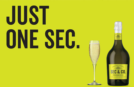
GOLD: SEC & CO, BY DENOMINATION
The judges approved of the packag- ing and the distinctive dumpy bottle. Harrison particularly liked the lime- green bottle.
ALTERNATIVE WINE PACKAGING DESIGN (INDIVIDUAL)
CATEGORY TROPHY WINNER: THE OWL & THE DUST DEVIL, BY FINCA DECERO
Smart phone app, possibly ground-breaking. Waterworth described it as “impressive”.

SILVER: FOURTH WAVE WINE, ELEPHANT IN THE ROOM, BY DENOMINATION
The judges thought the can designs were fun but at £19.99 for 4 x 25cl, they will be perceived as expensive for wine in such packaging.
ALTERNATIVE WINE PACKAGING DESIGN (RANGE)
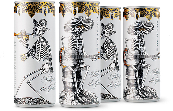
GOLD: TAKE IT TO THE GRAVE, BY DENOMINATION
The judges described the can design as “disruptive, progressive, attention- grabbing. Ticks all the boxes”.
SILVER: T’GALLANT SPARKLING, BY DENOMINATION
The judges did not feel the look was particularly exciting, but worthy of a silver medal.
DESIGN OF A FORTIFIED WINE BRAND (INDIVIDUAL)
GOLD: WYNNS PEDRO XIMÉNEZ, BY DENOMINATION
A very impressive, classy-looking, dumpy bottle to make this Australian forti ed ‘port’ distinct and away from the look of the traditional version.
DESIGN OF A FORTIFIED WINE BRAND (RANGE)
CATEGORY TROPHY WINNER: DOW’S AGED PORTS, BY DENOMINATION
The Symington Family Estates range of 10, 20, 30 and 40-year-old tawny ports is deeply impressive. Beautiful, discreet labeling, tall bottle.